Component Style
Writing component styles in a way that is easy to maintain over the life of a growing and changing project is a challenging task.
To solve this, we came up with the idea of style configuration or styleConfig.
This is a consistent theming API that makes component styling easy to understand
and maintain.
Base styles and Modifier styles#
Most component style consists of base or default styles and modifier styles that alter its size or visual style based on some properties or state.
Common modifier styles includes:
- Size: A component can have different sizes (e.g. small, medium, large)
- Variant: A component can have different visual styles (e.g. outline, solid, ghost)
- Color scheme: For a given variant, a component can have different color schemes (e.g. an outline button with a red color scheme)
- Color mode: A component can change its visual styles based on color mode (e.g. light or dark).
Single part and multipart components#
Most components we build today are either single part components (e.g. Button, Badge) or multipart components (e.g. Tabs, Menu, Modal).
A single part component is a component that returns a single element. For
example, the <Button> component renders a <button> HTML element:
A multipart component is a component that has multiple parts, and require these parts to work correctly. This commonly referred to as a composite component.
For example, a Tabs component consists of TabList, Tab, TabPanels, and
TabPanel. Styling this component as a whole might require styling each
component part.
Styling single part components#
The basic API for styling a single part component is:
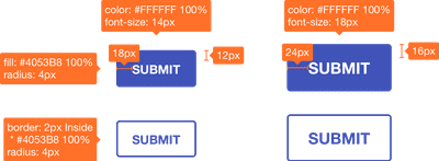
Let's say we want to create a custom button component following the design spec below.

Here's a contrived implementation of the design:
Make sense? Next, we'll update the theme to include this new component style.
Consuming style config#
Now that the button's style configuration is hooked into the theme, we can
consume within any component using useStyleConfig hook.
useStyleConfig API#
Paramaters#
themeKey: the key intheme.componentsthat points to the desired styleConfig.props: the options object used to compute the component styles. It typically consists of thesize,variant, andcolorScheme
Return Value#
The computed styles for the component based on props passed. If no props is
passed, the defaultProps defined in the style config will be used.
And lastly - the fun part - let's use our custom button component anywhere in our app:
Styling multipart components#
This is very similar to styling single part components with a few differences you need to be aware of.
- Given that multipart refers to a component with multiple parts, you'll need to
define the parts in a
partkey in the style config. - You'll need to provide styles for each
partforbaseStyle,sizes, andvariants.
Here's what the style config for multipart components looks like:
For example, here's what the style configurations for a custom menu component looks like:
Next, we'll update the theme object to included this new component style.
Consuming multipart style config#
Now that the style config is hooked into the theme, we can consume within any
component using useMultiStyleConfig hook.
We can also mount the computed styles on a specialized context provider called
StylesProvider. These styles will now be available to other sub-components. To
read from the context, use the useStyles hook.
useMultiStyleConfig API#
Paramaters#
themeKey: the key intheme.componentsthat points to the desired styleConfig.props: an option of the options for the computing the final styles. It typically consists of thesize,variant, andcolorScheme
Return Values#
The computed styles for each component part based on size, or variant. If
none of these were passed, the defaultProps defined in the styleConfig will be
used.
That's it! We can use our newly created multipart component in our application: